
18 Knowledge Base Examples That Get It Right


A knowledge base serves as a centralized hub that stores information, data, and knowledge related to a specific topic or entity. Its primary objective is to provide users with fast and convenient access to information, enabling them to resolve issues, find answers, and make informed decisions.
There are tons of reasons to have help documentation on your customer-facing site, but it’s not enough to just have it: If done poorly, your documentation may confuse or frustrate your customers even more.
From top to bottom, a knowledge base should be educational, motivational, and organized. It must answer common questions efficiently to save customers time and confusion. Most of all, a knowledge base should build upon itself to coalesce into an educational archive that’s accessible and practical.
The examples below are full of great ideas to work from to make your knowledge base content exceptional.
Meet Docs, Help Scout’s knowledge base solution
Help Scout’s Docs is an easy-to-use, accessible knowledge base builder. The tool has a WYSIWYG editor, AI-powered editing tools, and customization options, making it a great choice for teams looking to create a robust, media-rich help center without coding.
To give you an idea of how Docs might help your organization, here’s a look into our own help site, built on the Help Scout platform.
Site design
While we agree with Bill Gates that “content is king,” design and branding are important, too.

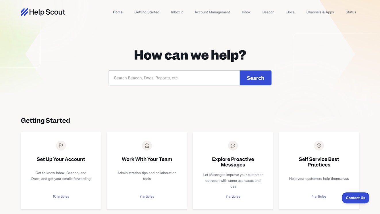
When people visit your knowledge base, they should immediately connect it with your organization. Help Scout’s Docs site uses the same color palette and design style that our main site employs, letting our customers know they’re in the right place.
The appearance of a Docs site is highly customizable, from your logo to the colors used to the site’s domain. Most changes can be done without any coding knowledge, though if CSS is your thing, there are options for that, too.
Knowledge base organization
If your knowledge base only has a few FAQs, its structure may not be as big of a priority. However, as your organization or product begins to grow, the information you will need to get to your audience will also increase.
Once this expansion hits, organizing your documentation will be key to ensuring that it is useful for your readers.
Knowledge bases built using Docs can organize their content using a three-tiered system consisting of collections, categories, and articles.
Collections
Collections are the top layer of Docs’ organizational system. Depending on your organization's needs, you may only need one collection, or conversely, you may need several.

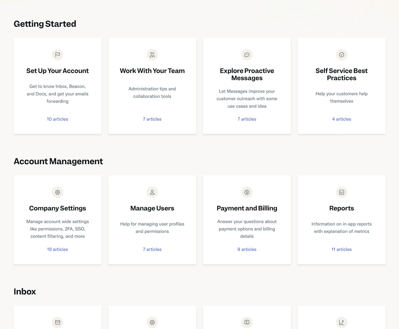
Each collection should cover different topics, products, or departments. For instance, the Help Scout Docs site is split into several collections, covering our three distinct product offerings — Inbox, Beacon, and Docs — as well as other important subjects like collections on Getting Started and Account Management.
Our Help Docs site holds a substantial amount of content, so splitting up the information by product and theme makes it easier for our customers to find the help they’re looking for without having to wade through irrelevant material.
Links to each collection appear in the help site’s navigation bar and the body of the home page for quick access.
Categories
Categories are the middle layer of our organizational system. They allow you to arrange information by topic within a collection.

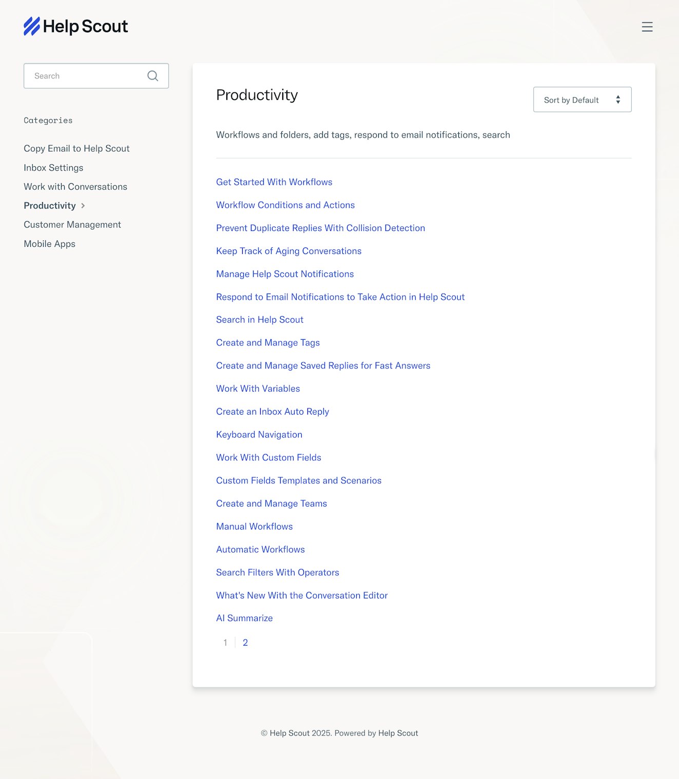
For instance, all documentation covering how to automate your work and increase your team’s efficiency when using Help Scout is in the Productivity category of our Inbox collection.
Articles
Articles are the main building blocks of our knowledge base. Each article should cover a specific issue or talking point.

Continuing with the same example, the Productivity category discussed above contains articles dedicated to specific Help Scout features that can help teams work more efficiently.
Having each feature discussed in a separate article makes it easier for people to find the right information when browsing through categories and searching the site.
Search
While some people may prefer to browse articles by topic, most help site visitors will arrive with a specific need already in mind. This makes a site’s search functionality its most important feature outside of the content itself.

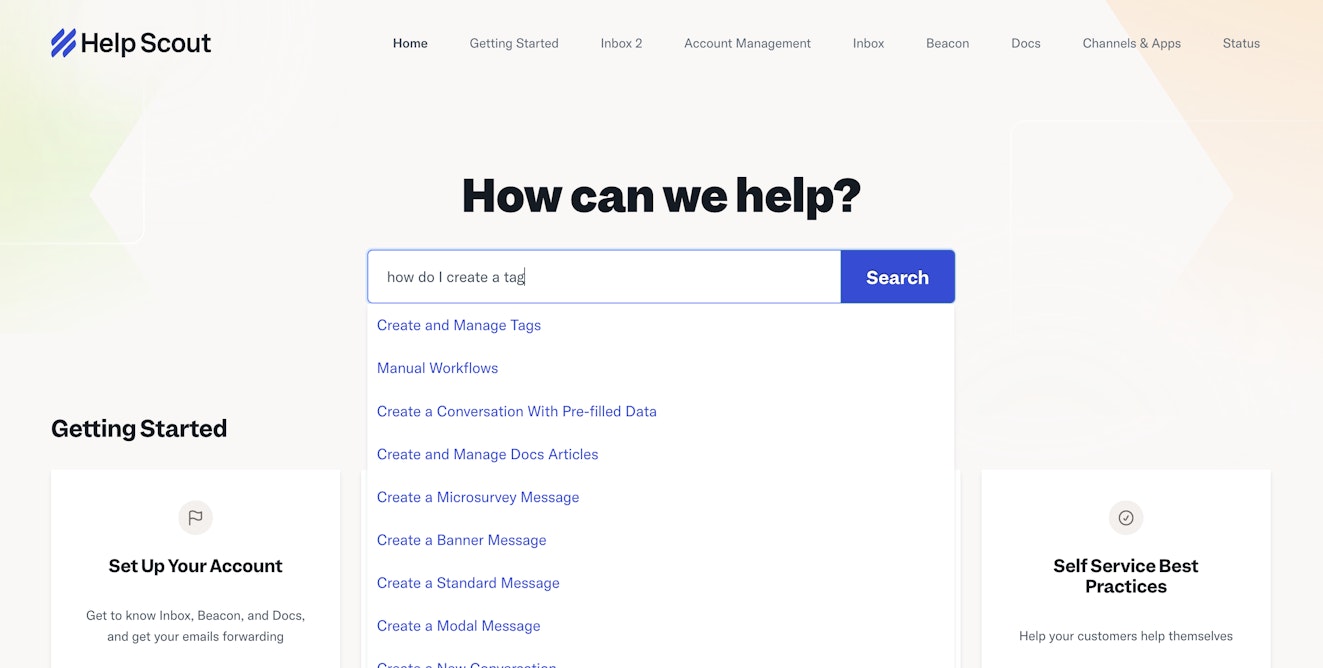
Our Docs site places the search bar front and center, making it easier for people to type in exactly what they’re looking for.
As they type, we offer suggested articles that align with their search terms. For instance, in the example above, someone is wondering how to create a tag in Help Scout. Docs suggests several articles, with the most relevant at the top of the list.
While not actually part of the Docs site, Help Scout Beacons throughout the site also allow customers quick access to knowledge base articles as well as to our smart search assistant, AI Answers.


With AI Answers, customers can ask a question in natural language and receive a relevant response based on our help content in seconds.
Quick access to additional support
While we try to make it easy for our customers to find the information they need in our knowledge base and throughout the Help Scout experience, some questions are better suited for email or live chat support.

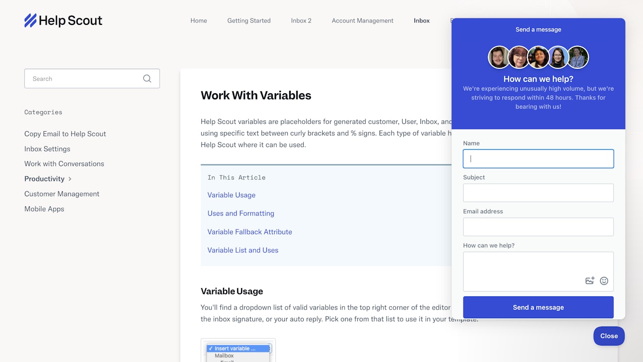
When on our main site, Beacon provides visitors with quick access to Docs articles and AI Answers to promote self-service. However, when someone clicks the widget from our knowledge base, they are presented with the ability to email or chat live with our support team.
Beacon’s ability to be customized is its superpower, allowing us to always present our customers with the right information at the right time.
18 additional knowledge base examples to emulate
Looking for more inspiration? The 18 knowledge base examples below will help you create a great help center that improves your self-service support in 2026.
1. Nike
Nike’s knowledge base does a great job of representing its brand.
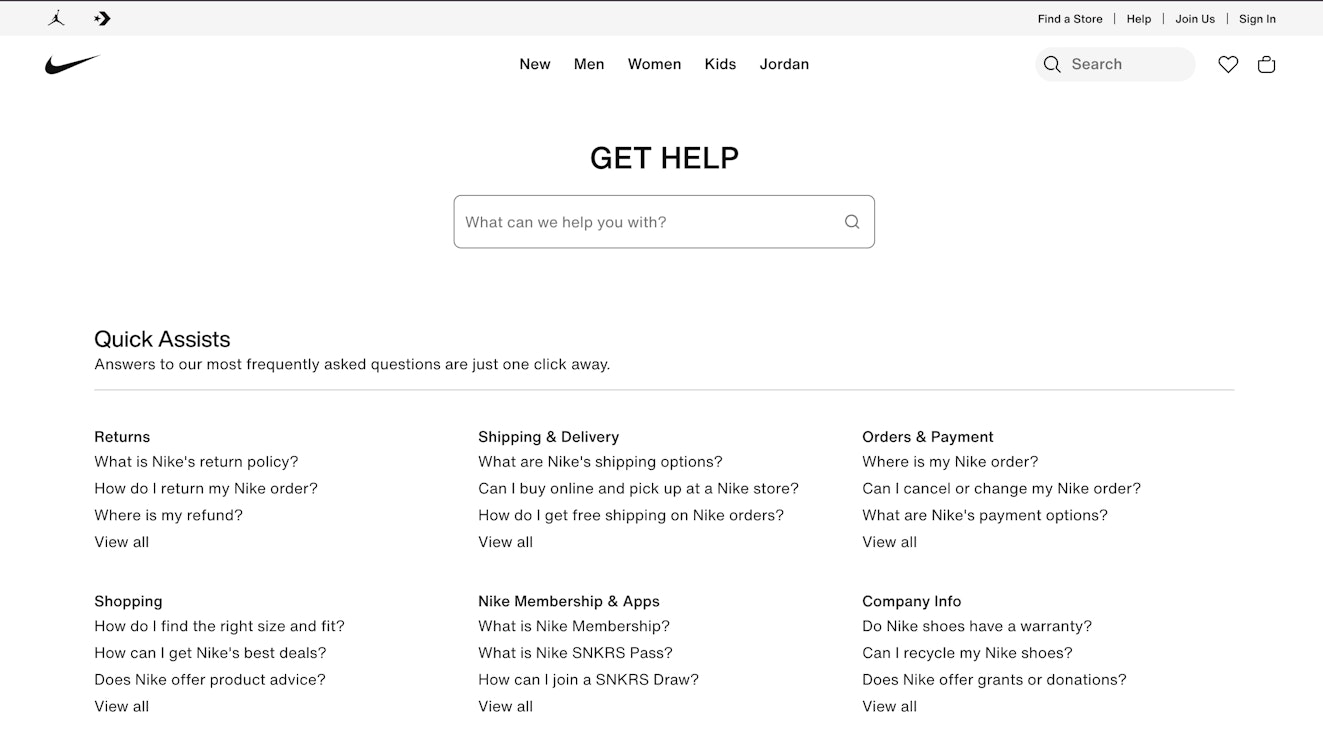
Instead of calling it a list of frequently asked questions, they use sports terminology and call it “Quick Assists.” They’ve also done an excellent job grouping commonly asked questions directly at the top.
It’s essential to ensure that your knowledge base reflects the tone and design of your brand; otherwise, your customers will feel alienated. Language and representation are critical, especially if this is one of the first things that shows up in search results for your product.
2. Spotify
Spotify’s knowledge base leans heavily on their brand colors and is easy to navigate and understand. It heads its knowledge base with a prominent search bar and also invites users to log in to receive faster (and more personalized) help.

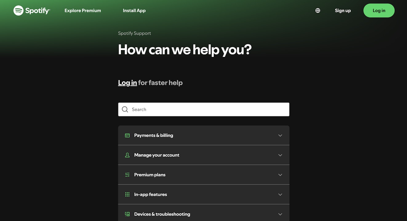
From there, it breaks down questions into topical buckets with an accordion style navigation system. Given that many users are likely on mobile, having this type of accessibility and simplicity is extremely important.
Spotify knows its users, and it uses that knowledge to make its help center fit its users’ needs.
3. Instagram
Instagram’s knowledge base is significantly more stripped-down than most would expect for such a design-driven, visually focused brand.

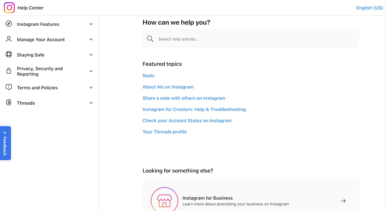
What Instagram does well is focus on the most important content. The simple design makes it easy for individuals to see what might be most meaningful or valuable to them.
Rather than needing to hunt for categories or scroll endlessly, this knowledge base empowers users. Similarly, given that most viewers of this help center are likely on mobile, the simplicity makes it even more accessible.
Finally, if the reader needs additional context or information, the search forward layout also makes it easy for the reader to dig deeper.
4. Lyft
Lyft does a great job making its knowledge base accessible on mobile devices.

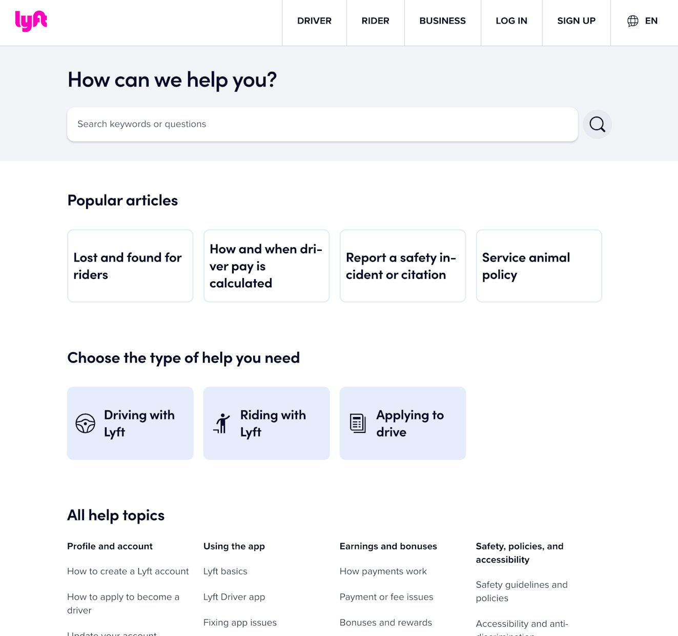
Lyft topped its page with a prominent search bar option, then popular articles and functional categories fall below.
The organization is what makes this knowledge base example stand out. Lyft has tried to make it as easy as possible for users to find the information they need with minimal work. It goes from the broadest, easiest option (a search bar) to a list of popular articles, then down to user-based categories before displaying the complete variety of help topics that it offers.
If a user doesn’t know exactly what they are looking for, this information structure will help them feel less overwhelmed in searching for it.
5. Airbnb
The first fantastic aspect of Airbnb's knowledge base is that they give the option to personalize the content shown by logging in.
If they choose to do so, the user’s name is added to the content, as are various categories that may interest them. Below the suggested categories are the same popular guides that the site displayed before logging in, and below the guides is another section that displays the site’s top articles.

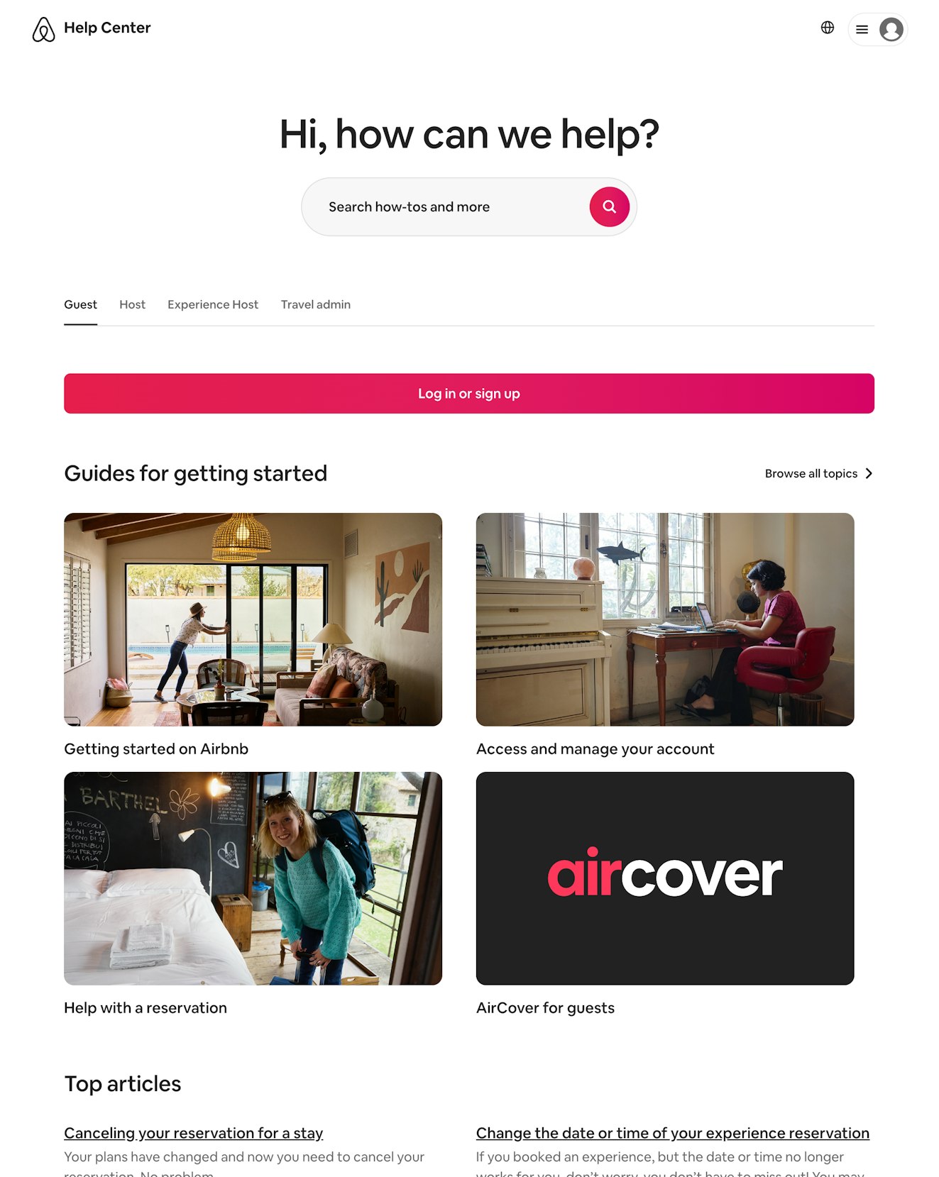
Personalization is a nice touch that helps the user feel seen and respected by the brand, especially if the content is personalized based on their recent actions in the product.
6. Dropbox
Dropbox's knowledge base makes it easy for users to navigate through its mountains of content.

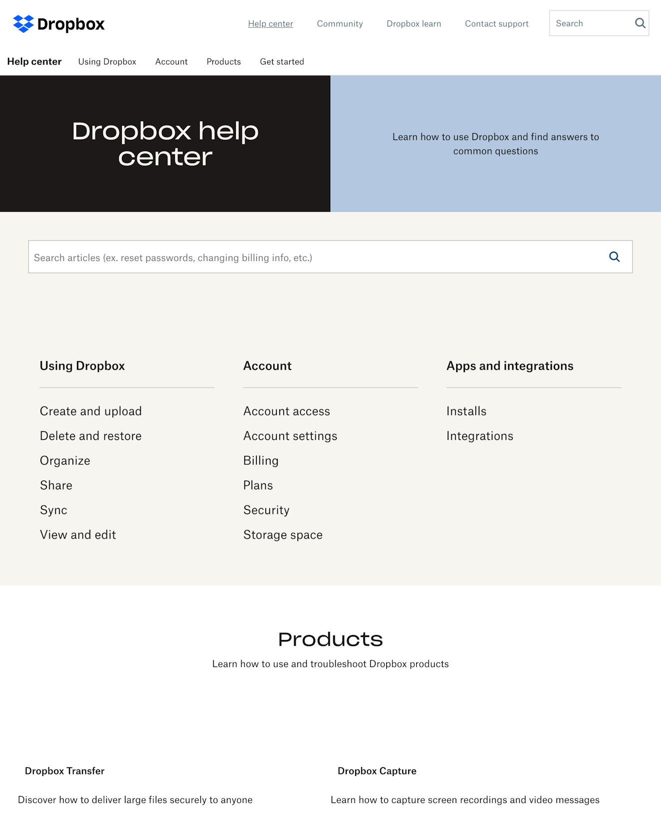
It starts its knowledge base with a series of tabs where users can click to navigate various content areas that may be valuable for them. If the options at the top of the page don’t resonate with a user, Dropbox provides a large, prevalent search box to make it even easier to find relevant content.
As users scroll, there are three columns, each displaying a topic with links to corresponding articles below. Further down the page is another area of the site where users can select the product they need help with and get moved to a page that provides product-specific content.
Dropbox tackles all of the various ways that a user might want to navigate a help center, making it easy for customers to find what they need quickly.
7. Amazon Web Services (AWS)
Amazon Web Services’ knowledge base is extremely simple and straightforward, which is precisely what its audience would like. This is an excellent FAQ example because of the navigation functionality and the organization of content.


You’ll notice helpful links along the left-hand side just in case the content isn’t serving the viewer’s needs. There’s also a promotional button to create a free account if the viewer doesn’t already have one.
Given how technical the target audience is, it makes sense that AWS would have detailed, technically-inclined knowledge base articles. Meet your users where they are, and regularly check your statistics to see how they engage with your content.
8. Billie
Billie's knowledge base is somewhat nontraditional. There’s no search bar and instead, the user first sees a visually appealing header image with a reassurance that Billie is here to help.


This example is so brilliant because it aligns with the tone of the brand.
As the user scrolls down, there are helpful links to navigate to main categories as well as questions listed out.

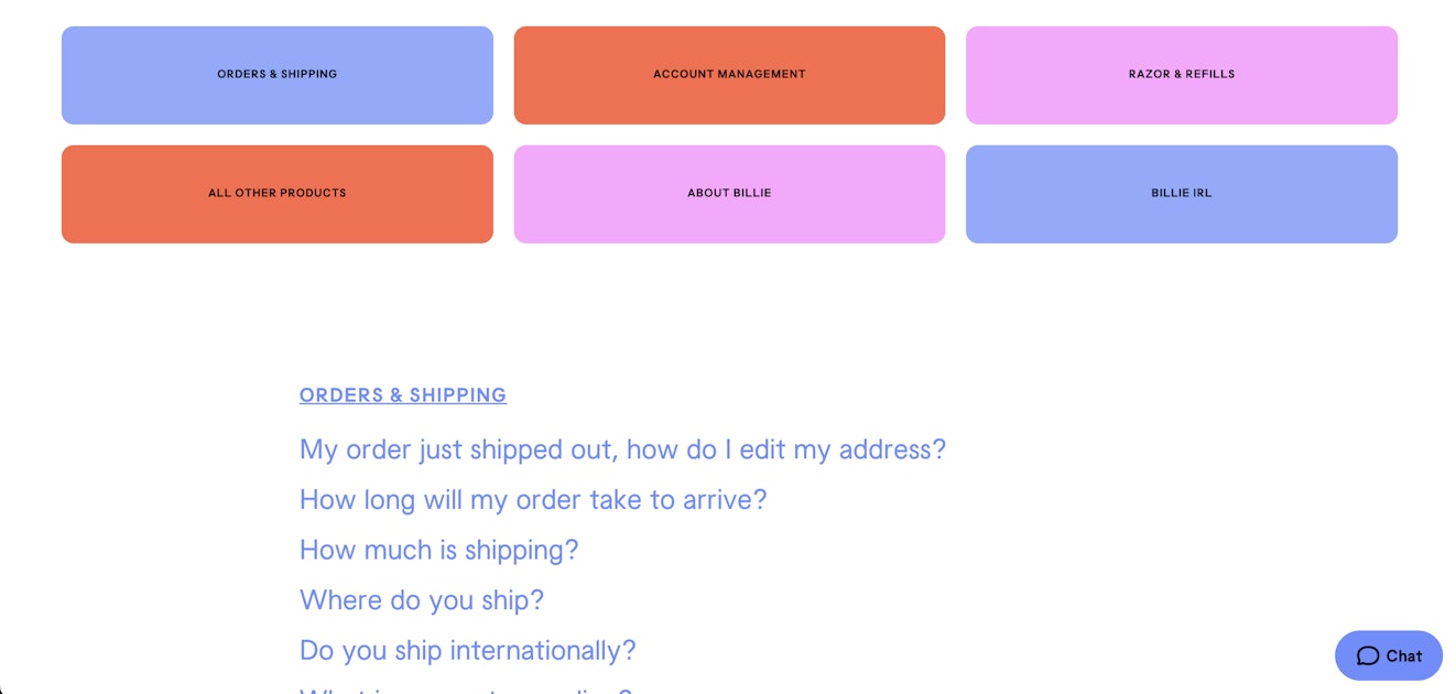
Billie is a playful, young brand that deals explicitly with aesthetics. Its help center must carry that same playfulness and beauty throughout.
9. WhatsApp
WhatsApp’s help center should look familiar as it has a nearly identical layout as its fellow Meta brand, Instagram, including a category accordion in the left sidebar, a search bar displayed in the main frame, and popular articles linked below.
Though the layout is similar, there is a bit more fun and playfulness to the iconography shown in the popular topics grid on the help center’s main page.

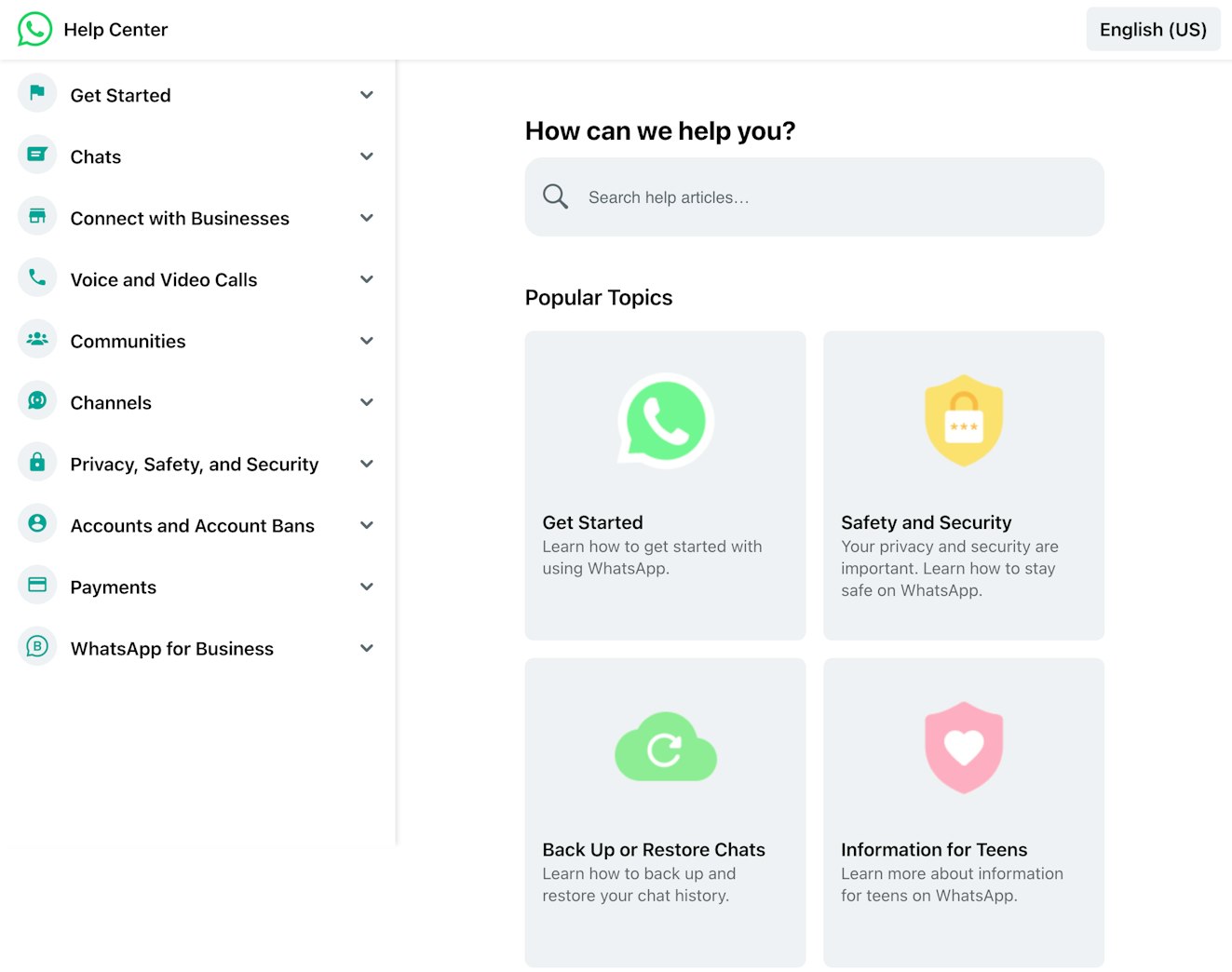
This is a good example of how businesses managing multiple brands can differentiate each of their knowledge bases with small changes like adding a pop of color or using brand-specific imagery.
10. ReadMe
ReadMe is software specifically designed for API technical documentation, so it should come as no surprise that its documentation is excellent.

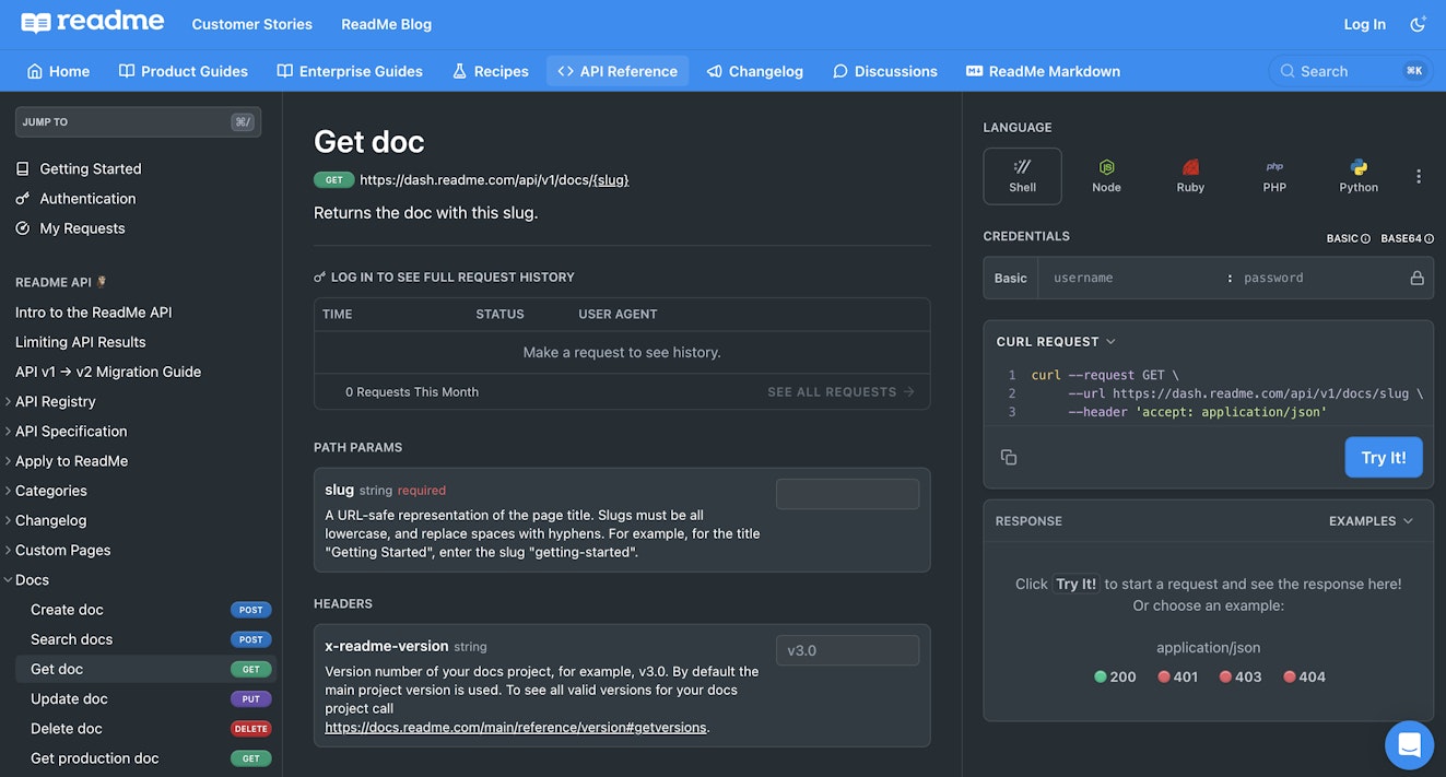
Most technical documentation does a great job of breaking down, step-by-step, what the user needs to do to accomplish their goal. ReadMe provides a virtual sandbox that lets you try running code within the knowledge base.
This lets people test in the language they are most comfortable with without needing to navigate away from the site. This function saves time, effort, and energy for the user and makes for a much better learning environment.
11. Starbucks
Starbucks’ knowledge base may not have been the most beautiful of knowledge base examples in the past, but these days it’s looking pretty clean.

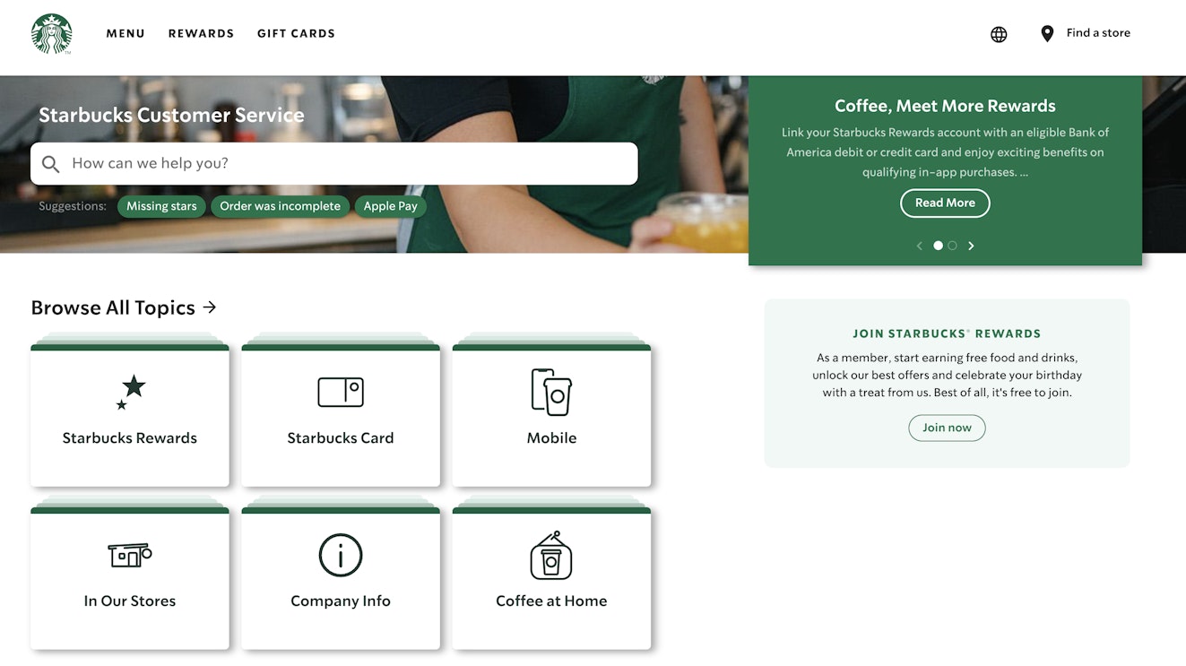
It leans heavily into Starbucks colors and branding and pulls out the most important topics into a grid with simple iconography.
Considering that many of its users are likely navigating on mobile and may not be technically experienced, Starbucks’ choice to keep things simple and prioritize important information is a good one.
Note that while it has usefully grouped documents in the main section of the page, there’s also a prominent search bar, which is the first thing the customer sees on mobile. There are even a few suggestions for common FAQs to help users navigate to answers more quickly.
We also like the “Contact Us” information toward the bottom of the page, as sometimes chatting with support is going to be the best option.


12. Broadcom
Broadcom is an IT/telecommunications company that sells both hardware and software necessary for networking businesses.

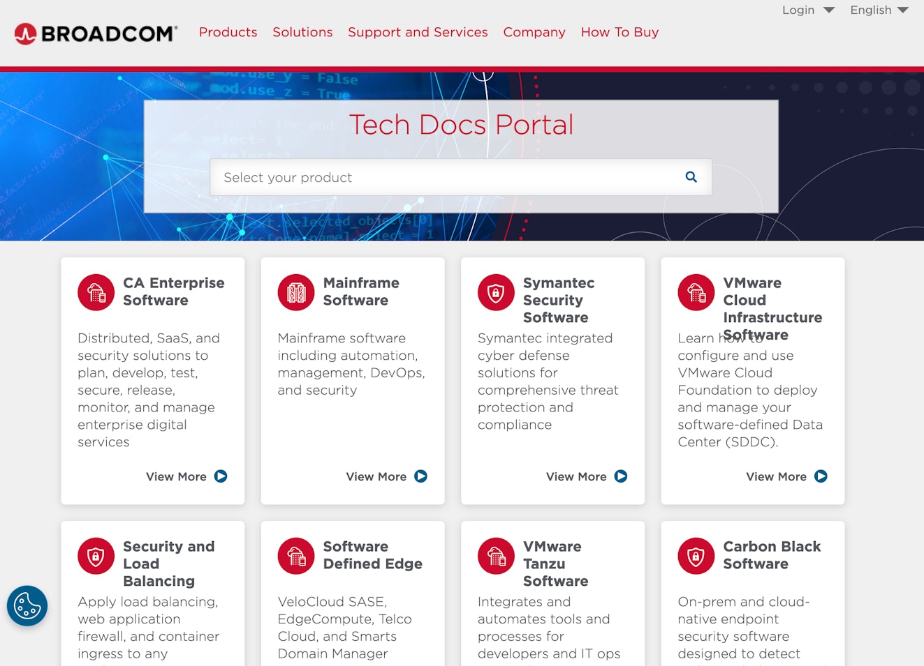
Broadcom breaks down its documentation into easy-to-navigate sections based on the solutions that it offers. Within each section are a number of subcategories, making it easy for users to navigate to the exact question they need an answer for.
Broadcom also tops its help center with a prominent search box in case the categories don’t make sense. A giant search box is a great navigation trick to ensure your users never get lost.
13. Pottery Barn
Pottery Barn’s place on this list of excellent knowledge bases may come as a surprise, but it has done a fantastic job supporting its customers in this way.
The first thing users see when they navigate to the Pottery Barn help center is a list of links to the most popular topics.
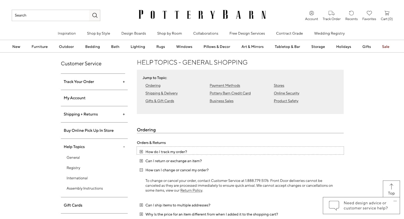
There’s a ton of navigation underneath for more in-depth topics, but Pottery Barn has taken care to prioritize the issues that its customers most frequently experience. You can do this, too, by creating tracking within your documentation and automatically surfacing your most popular docs.
14. Nimble AMS
Nimble AMS is a Salesforce-based association management system (AMS). Its knowledge base is on this list because it includes the most relevant and essential information at the top of the page.
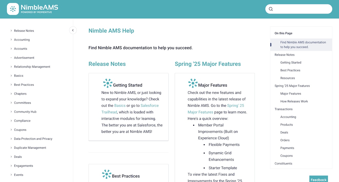
Nimble AMS lists its most recent release notes, its getting started guide, and a link to best practices right within the first section of the page. As the user scrolls, other relevant information appears, including functional navigation categories.
If you have a more technical product or are fresh to the market, it may be helpful to include your release notes on your FAQ or documentation pages.
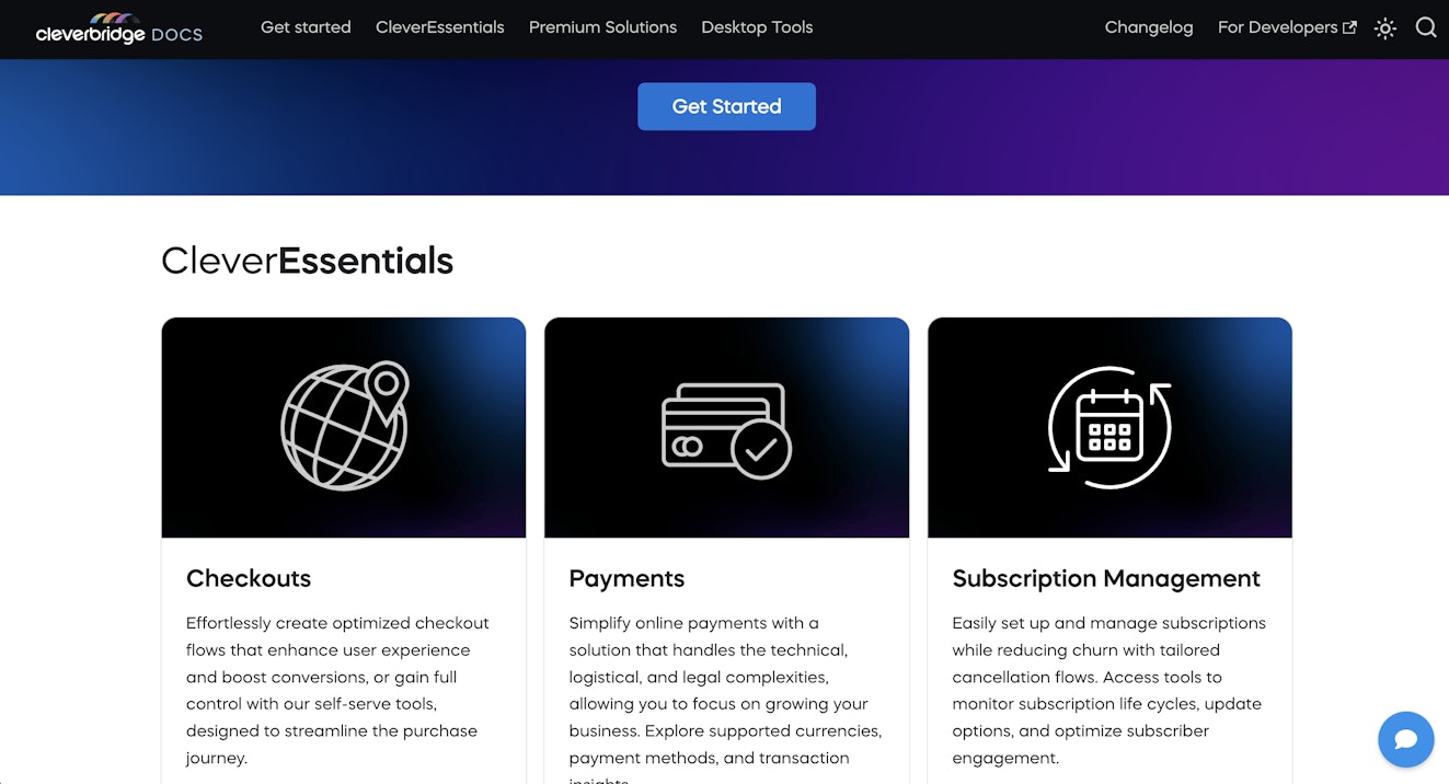
15. Cleverbridge
The first thing users see when they head to the Cleverbridge knowledge base is an explanation of what their product is above an intricate illustration.


While this is a slightly different approach from some of the other knowledge base examples, Cleverbridge has chosen to illustrate exactly how their offerings fit together, ensuring readers understand the ecosystem before diving in.
Just beneath the image there is a “Get Started” button that will jump the reader directly into Cleverbridge’s documentation. Alternatively, if the reader continues to scroll, information is broken down by offering — CleverEssentials, CleverAutomations, and CleverPartners.
The same product breakdown is offered in the menu bar.

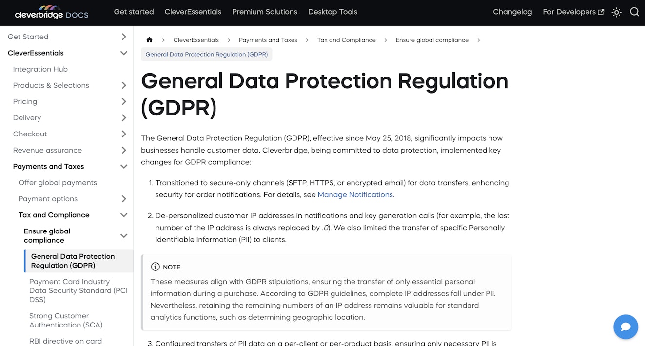
Clicking into any of these topics (or hitting that “Get Started” button) will send you to the related documentation. From there, everything will feel pretty familiar — there’s a handy accordion menu on the left sidebar with the documentation showing in the main frame.

While the design of the knowledge base’s main page won’t be everyone’s cup of tea, it is entirely aligned with the Cleverbridge branding. Viewing this knowledge base feels like an extension of using Cleverbridge’s product, and that’s definitely something to aspire to.
16. UCAS
The Universities and Colleges Admission Service is a UK-based service designed to help students get prepared for university or college, and its FAQ section is an excellent list of all the things that any student might need to know in getting started with its service.

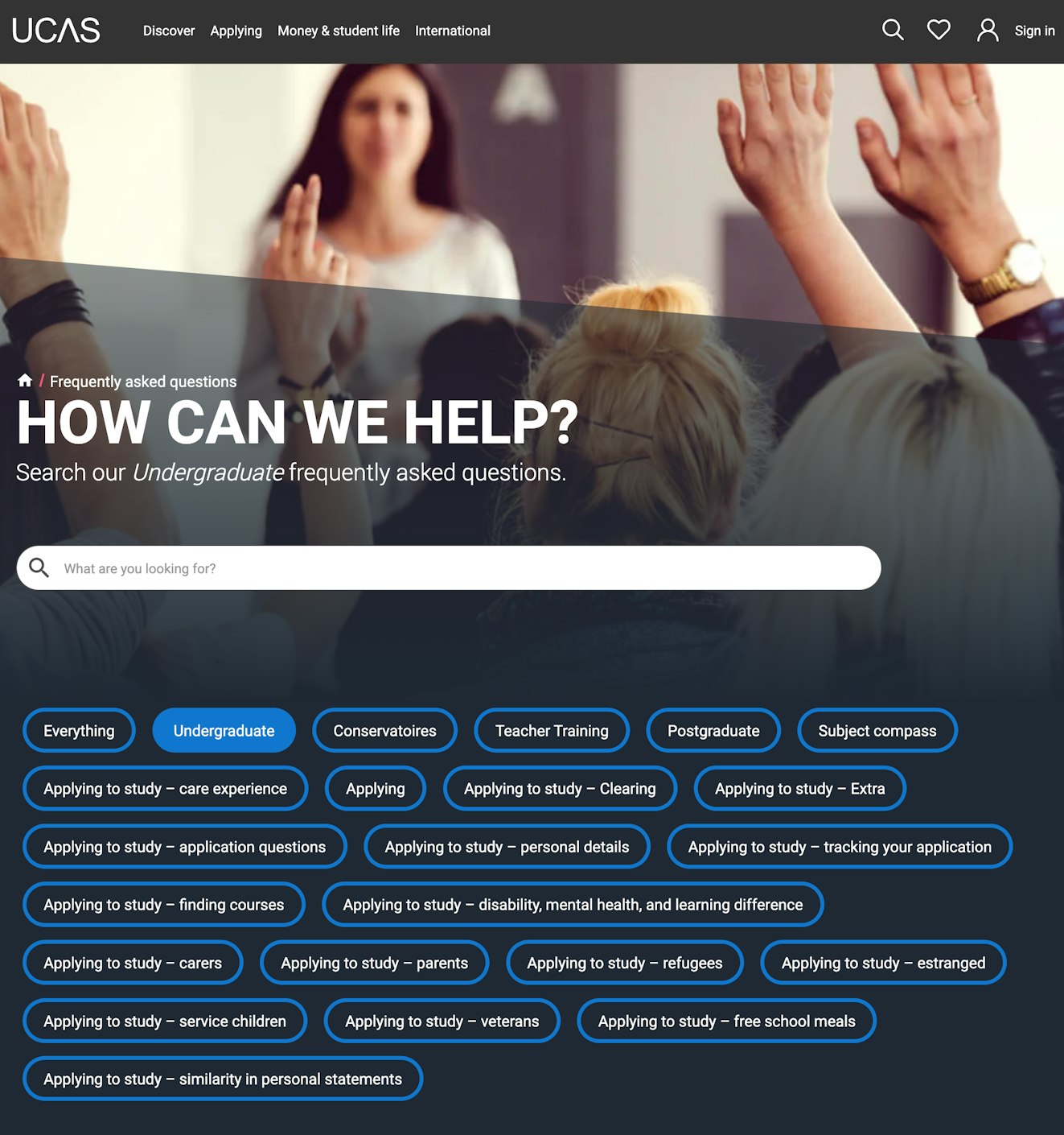
The first thing you see is a search bar with a huge list of potential topics that might interest the reader. Clicking on any of the topics will change the list of questions listed lower on the page.
Each question is clickable and opens up with an accordion into the answer right within context.

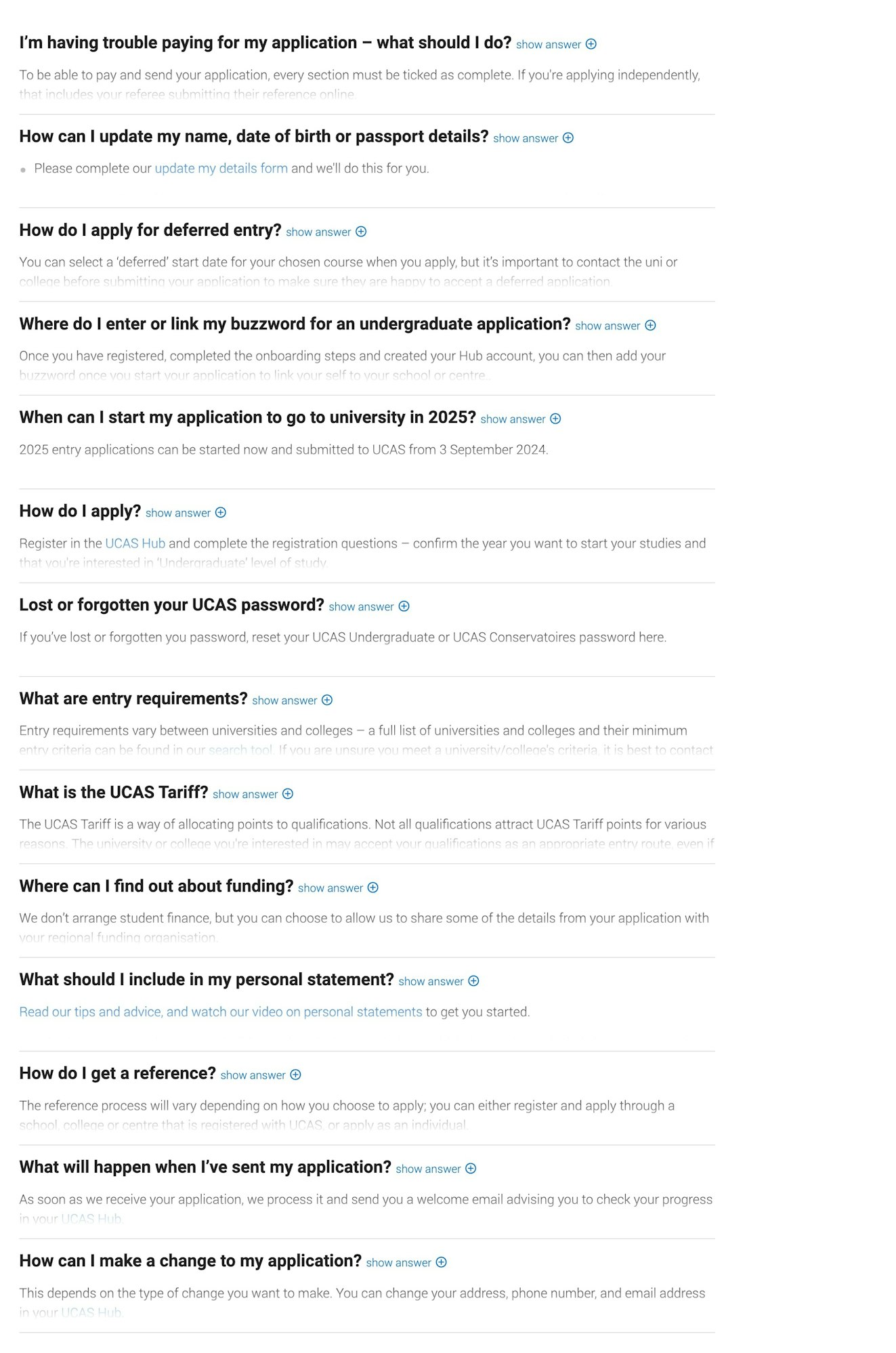
Viewing everything at once allows users to get their answers quickly and then branch out to other areas to continue learning.
17. UPS
UPS might not be notorious for excellent support, but its knowledge base is a perfect example of customer focus.

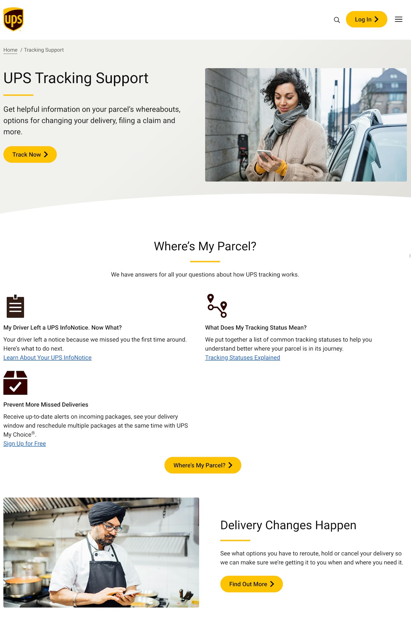
If there’s one thing a UPS customer wants to know about, it’s where their package is, so the top portion of the help center is focused on answering that question. It offers a link to the UPS tracking page, followed by helpful articles to help customers navigate some common delivery issues.
Another impactful feature of this knowledge base is enabling users to reach out directly if that’s something they’d like. Halfway down the page there are prominent links to file a claim or contact support, which are likely the most common actions behind parcel tracking.

The page wraps up with an accordion style FAQ section answering more specific questions that might pop up for customers. While it might seem strange that UPS has the FAQs buried at the bottom of the site, it makes perfect sense.
Just like we said up top, customers want to know where their package is and who to talk to if it doesn’t arrive. FAQs are great, but customer focus means providing the most important information first, and UPS does a great job of that here.
18. First Direct
First Direct notifies customers if they can expect delays when reaching out and provides them with other alternatives to resolve their issues more quickly.

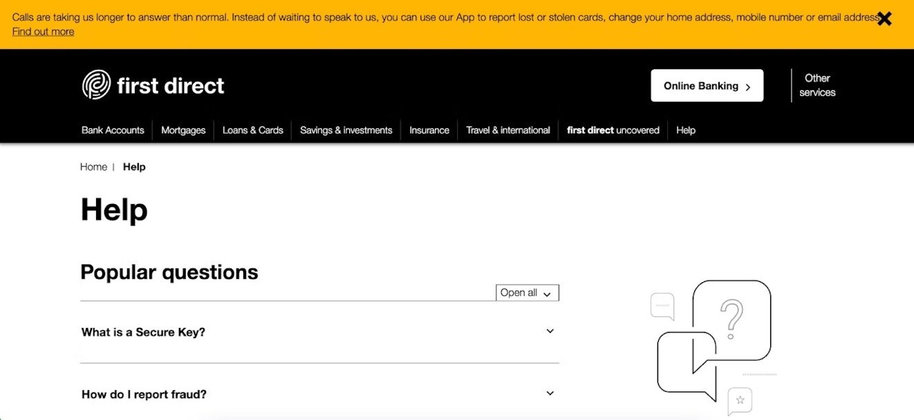
Below that, it breaks down its content by product, making it easy for users to self-select where they need to go.
First Direct includes product support and advice on how to get the most out of its product, like saving money or the best ways to deal with financial difficulty. This page, like some of the other examples, helps educate customers on ongoing usage rather than just teaching how to use the product in the beginning.
Use these examples to make your knowledge base shine
The “Open” sign is always lit for an online business — at least that’s how the customer sees things. Looking for help even at odd hours and not finding it carries the same disappointment as showing up to your favorite restaurant and finding it closed.
Although your business may run 24/7, you don’t (and shouldn’t).
By having a helpful knowledge base that’s easily accessible, as well as a great support team for those problems that need a little extra help, anticipatory service reflects something remarkable about an organization: their vigilance, precision, and understanding of the whole customer experience.