While you shouldn’t judge a book by its cover, you should judge the written word by its styling. Appearance there is far more than skin deep.
The primary objective of all writing is to communicate information. Since faulty styling impedes on this, it is a trait of bad writing.
Clearly written prose is paramount when you go to write support emails. Don’t let your keystrokes go to waste through bad styling.
Read on below to make sure each and every email you send is heard loud and clear.
This is a chapter in our Ultimate Guide to Email Management. When you're ready, check out the other chapters:
Chapter 1 – How to Write Support Emails Your Customers Will Love
Chapter 2 – Writing Support Emails: A Style Guide
Chapter 3 – Building a Newsletter Welcome Series from Scratch
Chapter 4 – Email Response Times: Benchmarks and Tips for Support
Chapter 5 – 7 Shared Mailbox Best Practices You Can Put Into Action
Chapter 6 – Inbox Zero: The Fast, Empathetic Way to Get Your Team There
Chapter 7 – Google Collaborative Inbox: Pros, Cons, and 5 Alternatives
Chapter 8 – 12 Shared Inbox Software Options for Team Collaboration
Chapter 9 – 12 Tips and Tools to Better Manage Your Work Email
Chapter 10 – The 9 Best Team Email Management Software for 2024
Chapter 11 – Choosing an Email Ticketing System: Our Top 11 Picks
Chapter 12 – Setup Guide: How to Create a Shared Inbox in Gmail
Consider the Customer’s Workflow
A poorly written support email reads like a slapped together instruction manual. Unless you want customers floundering about like a fish out of water assembling an IKEA TV stand, it pays to get the “flow” right.
This means considering how a customer will actually approach the advice you’ve given them. Are your implied “Steps 1, 2, & 3” the actual order the customer should be doing them in? Are they logically organized, not only by what should be done, but by difficulty?
Here are three principles to live by:
Always explain things chronologically.
No exceptions. The first thing customers should do must be Step 1. As with all these steps if <you can do it for them, you should.
Order by difficulty.
A support email can also be organized by complexity. If multiple tasks can be performed “first” (i.e., order doesn’t matter much), have customers do what’s easiest first. Early friction decreases the likelihood that they’ll finish or even follow your advice.
Be mindful of workflow.
This is a bit more abstract—in general, we all recognize that if you link someone to a video a few paragraphs into your email, you increase the chances that they’ll get distracted. For support, this means structuring responses in a way that keeps readers in the email and doing/reading things that won’t interrupt their problem-solving workflow until they are near the end.
Recognize that “reader fatigue” and “click fatigue” go hand-in-hand. Similar to assembling help content, place links strategically in sections to nudge customers into clicking them only when ready.
Use Underline, Bold, and Italics
There’s almost no reason to ever underline text in emails.
Bold is a fantastic way to clearly organize the customer’s queries into segmented responses. It becomes poorly utilized when you start emphasizing random words that make people place emphasis for no reason. Don’t do it.
You can even reframe a customer’s question to add clarity. Bold what they’re really asking, and respond underneath. An example customer email:
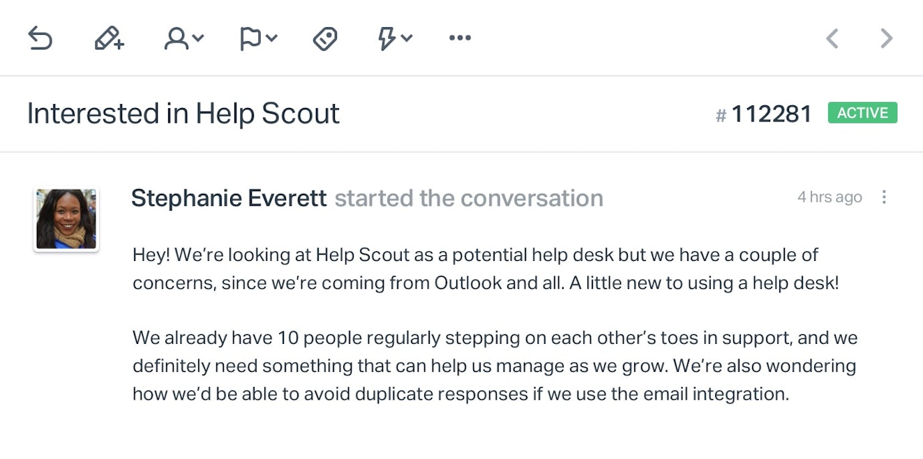
The theoretical email above is one that many customers will send—well meaning, but not exactly clear. Decipher for yourself, and use bold to organize your responses.
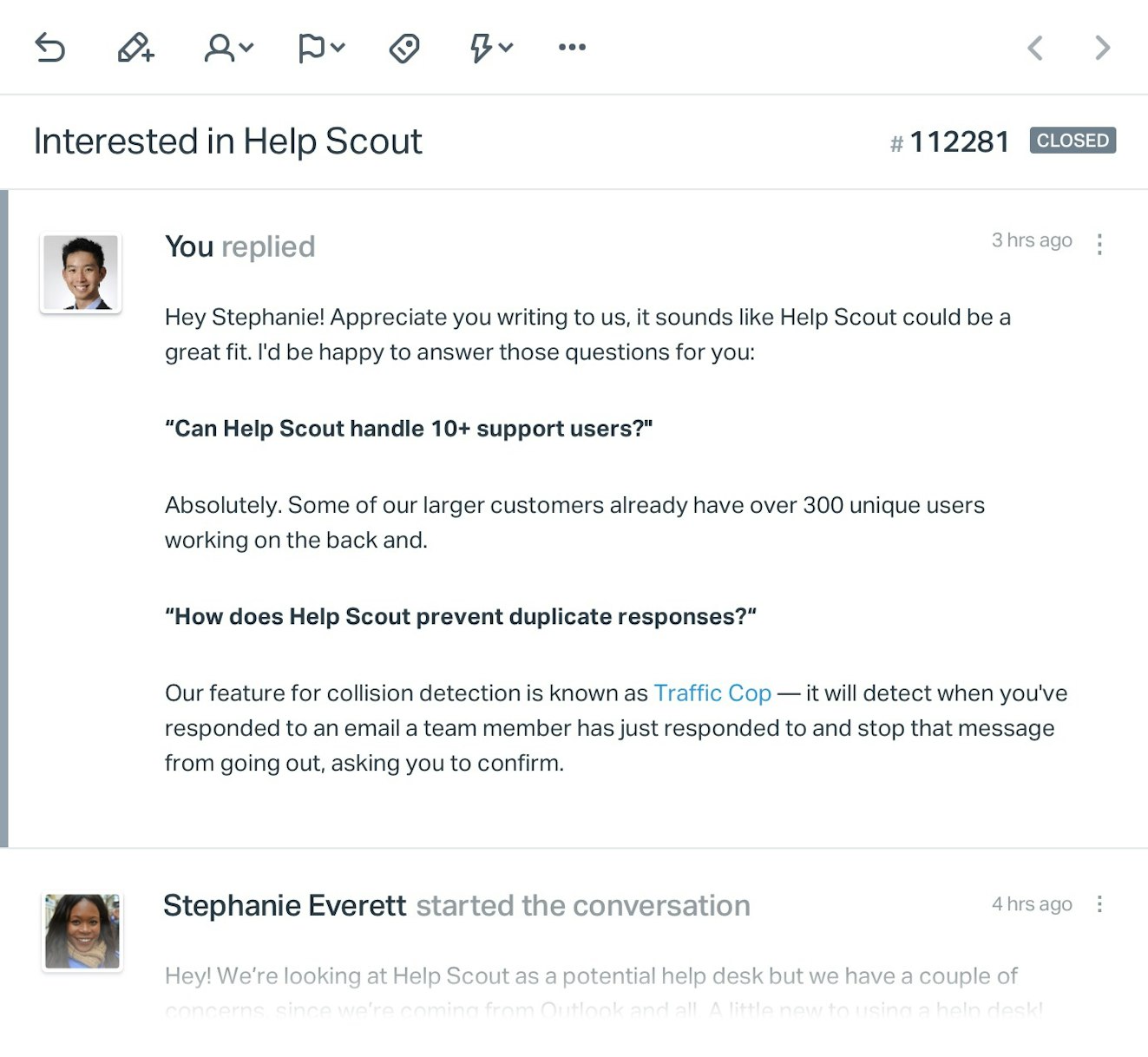
In short, bold is best left for framing a response. It allows you to chunk off sections for easy reading, much like a sub-headline.
Italics are useful for placing a lighter touch on points of interest. For instance, telling a customer to “go to your settings” is okay, but a better response would be “up in the top right, click on My Settings.” The emphasis brings attention to exactly what they should be looking for.
Do not force your customers to suffer through an entire paragraph of nothing but italic font. It isn’t easy to read, and it’s a misuse to apply it everywhere instead of strategically using it to act as a highlighter.
Using Bullets, Links, and the P.S.
Writing for the web lends a distinct advantage. You have flexibility in structural style that helps make for easier reading.
Bullet points are a common example. Make use of bullet points to “ladder” lengthy sets of instructions. When discussing an ordered list, use numbering. Example below:
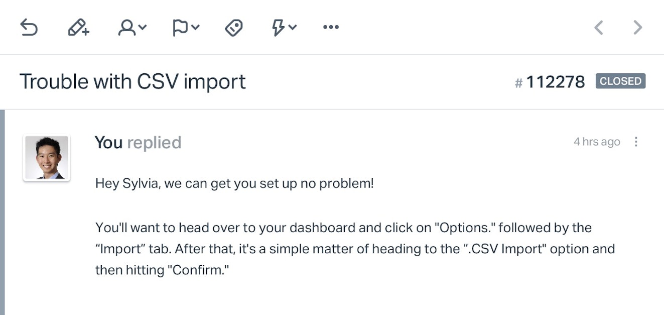
Blunt wording that gets right to the point, but it could be even easier to follow:
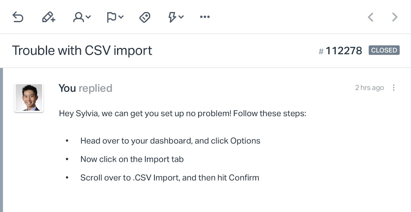
Seems obvious, but I’ve had many support responses that missed an opportunity to make my life a little simpler by structuring the steps this way.
Links are a bit trickier. It’s fairly well-established that an excessive amount of linking in any piece of writing will diminish comprehension. They become too distracting. But a differing principle that comes from email marketing is that links that stand out are links that get clicked.
This matters when you’re sharing an important piece of documentation or just something the customer needs to see. Two examples below:
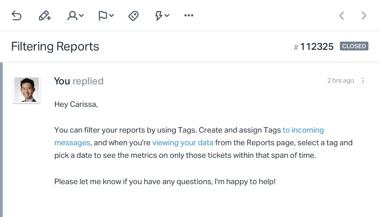
The problem with the links here is that they are buried within the message and the anchor text isn’t descriptive enough. You might not think of support emails as needing a call to action, but it’s a principle that applies outside of marketing. It’s an encouragement to get things done and can easily be applied here.
Let’s try that again:
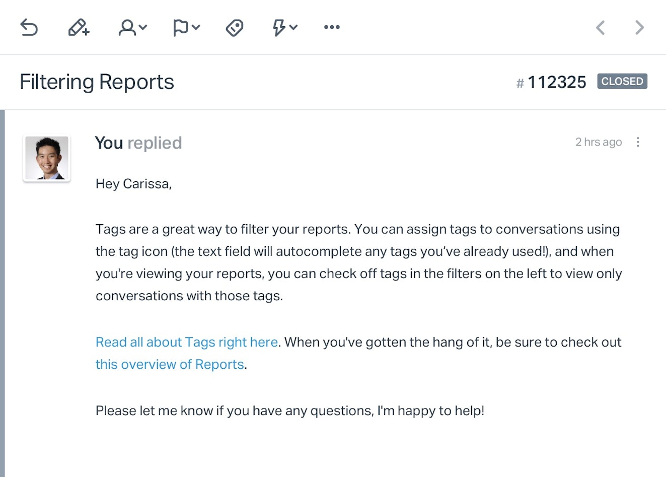
This gives you the flexibility to keep messages short should you need, but it doesn’t interrupt the customer while they read the overview. You also give them a clear “what to do next” by having a section written around the links. Use descriptive language for the anchor text; don’t be above writing “Click here for (blank)” if you think it will add clarity to your instructions.
P.S. Did you know that the P.S. is the most consistently read part of any email? Direct response copywriters have known this for decades, and they often put some of their most compelling writing in this area.
For support, how you use this depends on the conversation, but it’s a great place to close a conversation with messaging like, “PS: Be sure to let me know if there’s anything else I can do for you, happy to help!”
That’s a wrap. Be sure to consider and use these quick styling tips to help you organize communication in a way that is beneficial for you and your customers.


