Our Design team at Help Scout is distributed across three continents and five time zones — working remotely, but paired closely with Engineering, Marketing and Content teams located in a further 50+ cities around the globe. From little home studios in suburbia, to coffee shops and co-working spaces in the city, we thoroughly embrace the challenges and rewards of being 100% remote.
One of the considerable challenges when designing remotely is how to remain productive, creative, and collaborative when there’s no one else around — an especially big issue with our Australian crew, who have very little time zone overlap with North America. How do you receive meaningful feedback or share work in progress when everyone else is asleep? These are the challenges that come easy for in-house teams — solved by over-the-shoulder design reviews and impromptu team discussions — but need a little bit more consideration to work in a remote setting.
6 tips for collaborating on a remote design team
After some trial and error, and under the expert guidance of Design Lead Linda Eliasen, we’ve uncovered a few tips and tricks that have helped us form a healthy and productive design team culture — one where we all feel inspired and proud of the work we’re doing.
Whether you’re starting out as a remote designer, managing a distributed team, or just want to find ways to improve your existing workflow, here are a few tips that might help you navigate the scary and exciting world of remote design.
1. Daily video walkthroughs
Sharing designs and gathering feedback is a critical part of any design role, remote or otherwise — yet there’s some magic lost when posting flat JPGs to Slack. Context is lost, words are overlooked, and the level of detail or feedback required isn’t immediately obvious.
The answer is to record videos — a practice that has made one the biggest impacts to team collaboration at Help Scout. Some days these videos come in the form of narrated user journeys via InVision, other days they will be videos of a designer navigating around concepts in Sketch. But whatever the format, these videos tend to be raw and scrappy, and they help to frame both the problem each designer is trying to solve and the journey they’re taking to find a solution.
The videos are rarely more than 10 minutes long and usually contain a bunch of awkward mouth-noises and mistakes, but sharing these quick and unpolished chats is almost like presenting in person. What’s more, the team gets the chance to watch, consider, and then provide feedback at their own pace — which in some ways is a little better than an in-person meeting.
For me in Australia, I try to share a video at the end of my working day, which makes every morning a little bit like Christmas when I open my computer to heaps of feedback and fun ideas to explore.
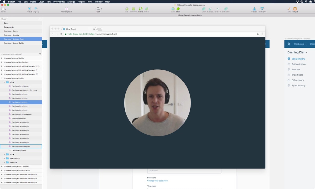
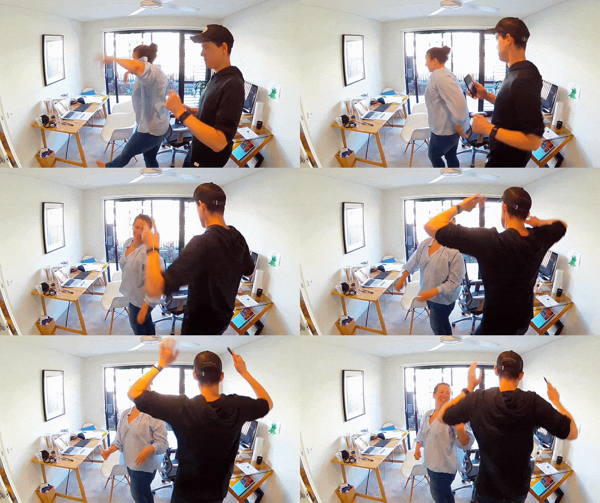
We use Loom for quicker videos like the one above, and Wistia’s Soapbox for when there’s a bit of finesse required (they let you edit). We don’t always look our best working remote, but sometimes it’s important to show the team our smiling faces to communicate just how excited we are about their progress, or how a smooth interaction gives us jazz hands and uncontrollable eye-twitches.
Personally, I’ve found that an interesting side effect of video walkthroughs is that I’m more comfortable talking about the more vulnerable side of design — failed concepts, ideas that didn’t pan out, or problems that I have no idea how to tackle — than I am when writing things down.
2. “WIP” docs
Communicating work-in-progress (WIP) for active projects is another painful task when done wrong. Images shared in project tracking tools can get lost in the noise, feedback can become buried, and almost no context or sense of progression is maintained. Our solution? Nothing fancy, just a good ol’ Dropbox Paper doc.
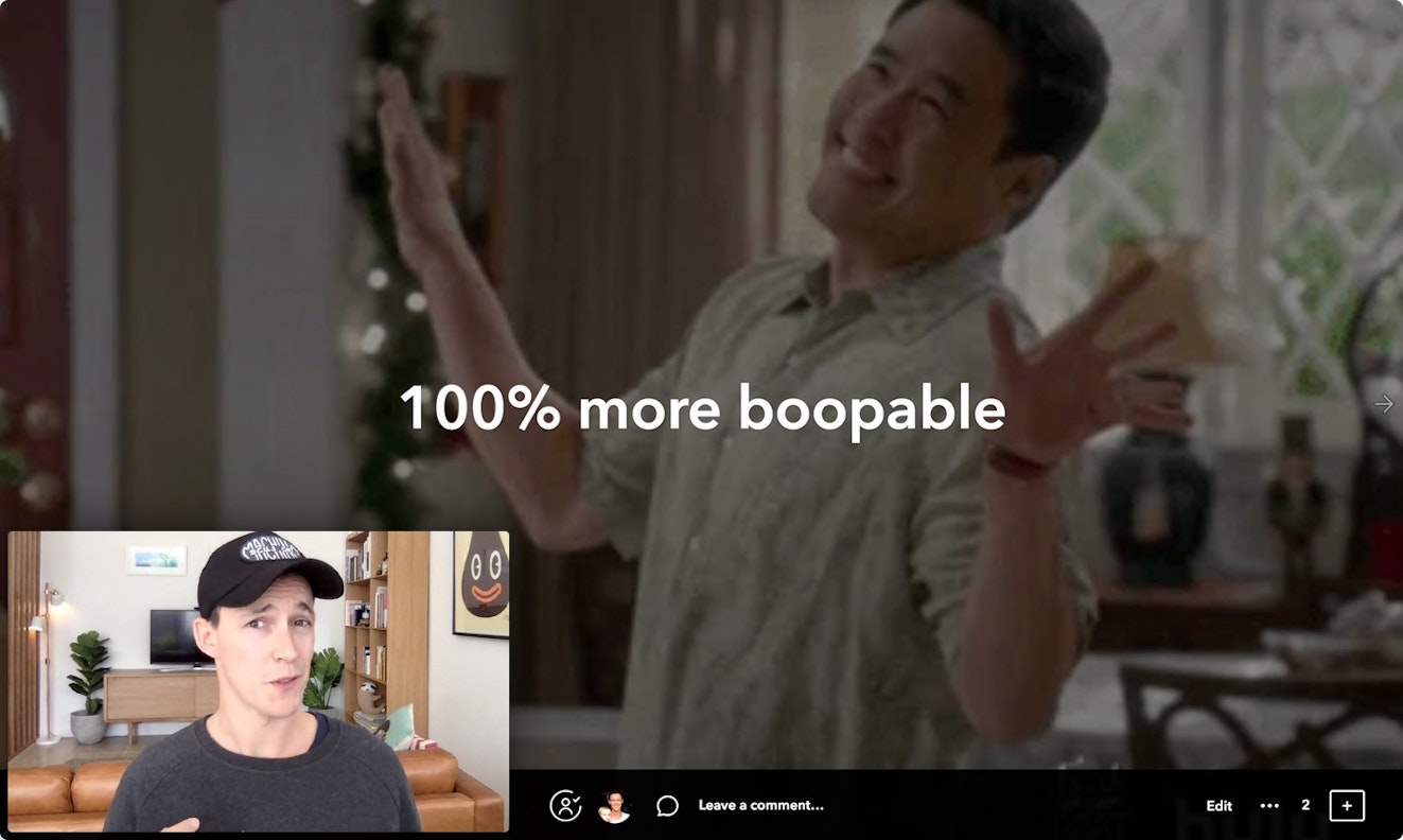
Whenever a designer starts a new creative project, they’ll generally create a single Paper document which can be accessed by the entire company. It’s always named “🤓 WIP: Project Name” and has an entry for every day the designer has something to share. Then under that day’s heading, they’ll quickly drop in a few screens and annotate some of the areas for discussion — then share with the team (usually accompanied by a daily video walkthrough).
Here’s an example WIP doc I’m working on right now:
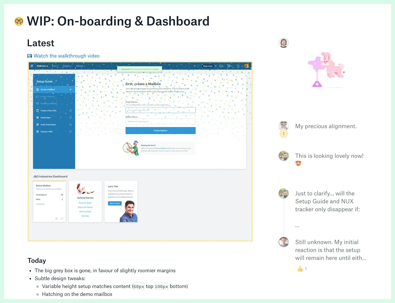
Aside from the obvious benefit of being able to collect feedback in one centralized place, this format also does a great job of communicating the journey a project has taken. Since the doc starts with the latest work, anyone with an interest can scroll down to go back in time and see how a design has evolved — forming a permanent record of why certain decisions were made, who was involved, and the discussion that helped inform the result.
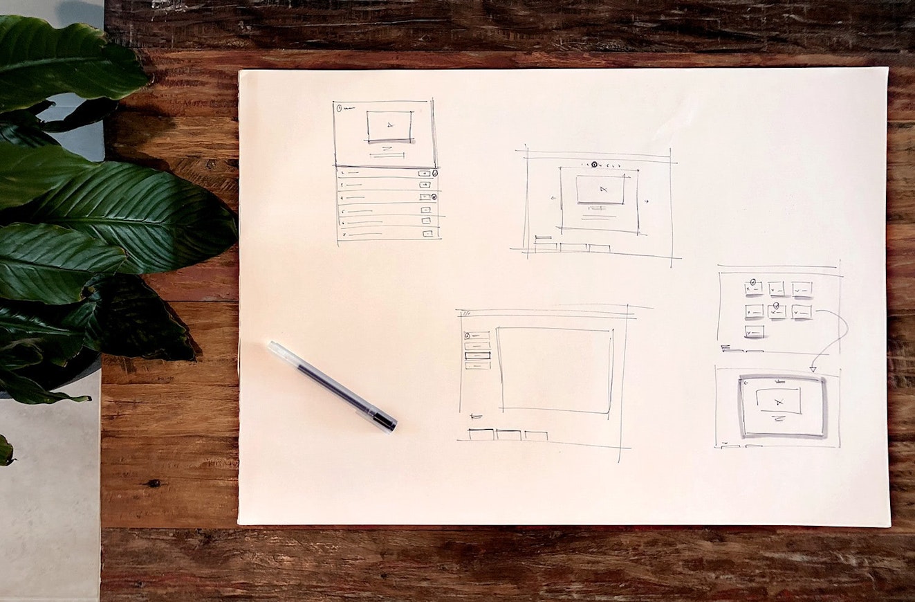
Of course there’s also no harm in showing sketch work either…
3. Show, don’t tell
It’s easy for big teams to get blinkered by the details, especially when everyone has their heads down on building a big feature. In these times it becomes the job of designers to help renew excitement by teasing some fun ideas or sharing concepts for future features. Visual inspiration goes a long way — after all, showing is more powerful than telling.
In an office environment, you can easily achieve that by sticking concepts up on the walls or by pitching ideas over a few Friday beers. Working remotely, we’ve found the best way to achieve the same thing is for everyone to share something fun in a “Design Daily” Slack channel, which is accessible to the whole company. Stuff shared here tends to be slightly higher-fidelity — animated prototypes and interactions that make a static design feel tactile and real.
We also share a bunch of prototypes to bring life to spec docs and Trello cards. One of the biggest benefits of prototyping isn’t necessarily to dictate how an interaction should be built, but rather to inspire how great something can feel. Even if they’re silly ideas, small moments of visual inspiration like the one below can get others excited about what could be.
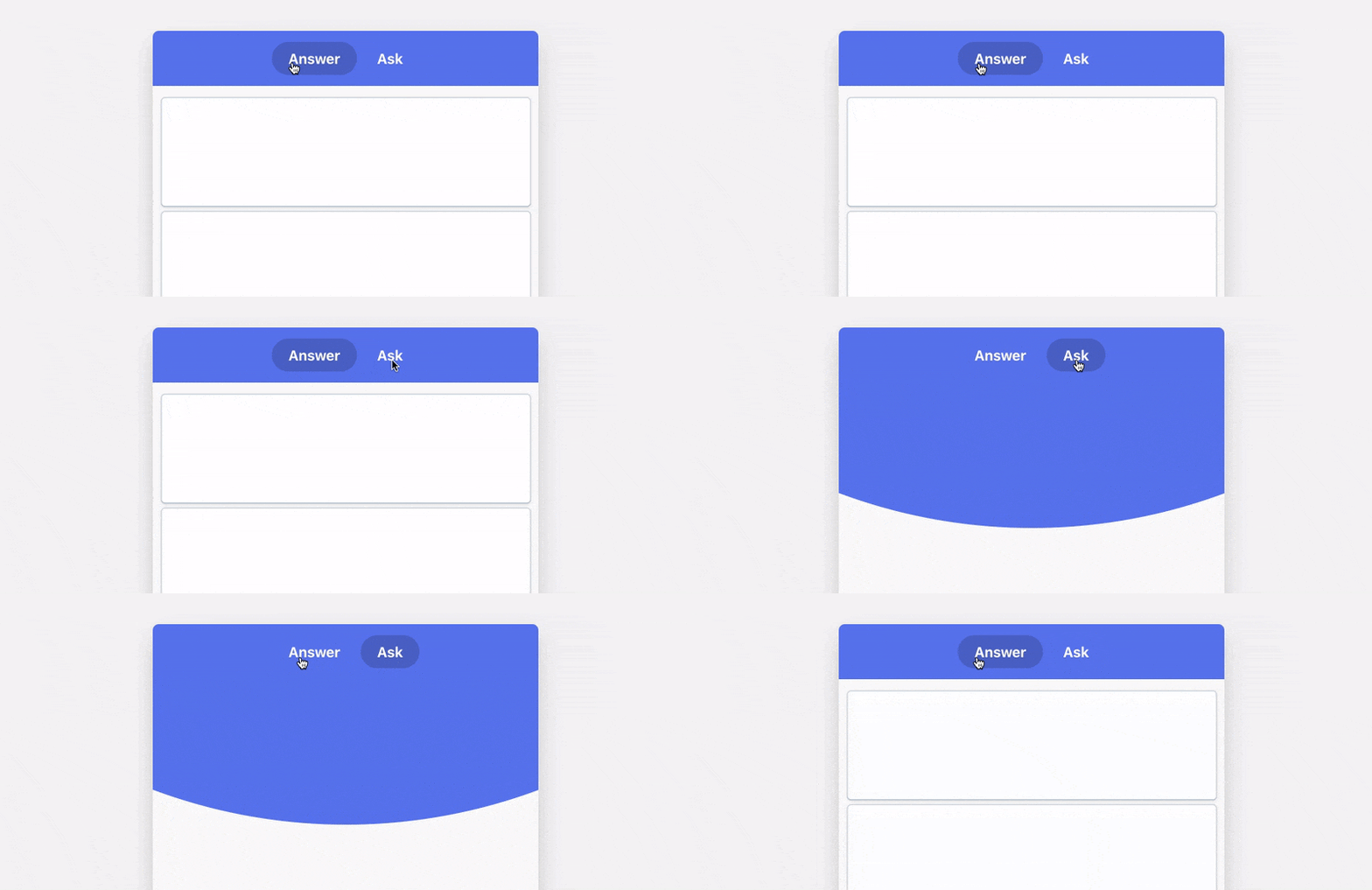
Without getting into the “should designers code” debate, our prototypes are made by whatever means the designer feels comfortable — so they vary between After Effects, Photoshop, Framer or developer tools. Personally, I like to write quick-and-dirty HTML in Codepen, record it with QuickTime, then convert the video to a GIF using this witchcraft. Whatever your flavor, it’s worth the effort.
4. Make time for face-to-face interaction
There’s no substitute for talking through design challenges in real time — it’s especially useful for clarifying briefs and problems before you begin digging in. The most valuable video calls are ones where two designers spend five minutes screen-sharing, centered around the problem of “This doesn’t look right and I don’t know why.” If you’re worried about video being jumpy and awkward, at Help Scout we use Zoom, which works especially well across shaky internet connections.
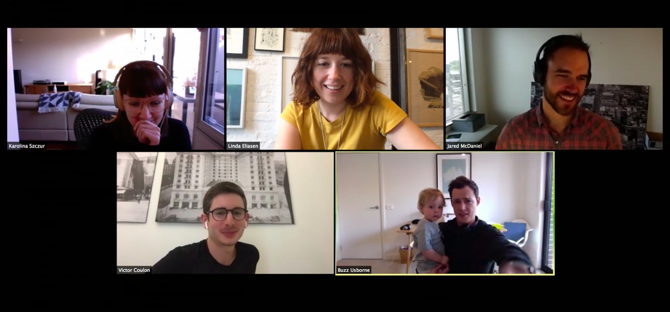
These one-on-one calls also complement larger team meetings, which we do a fair amount too. Our Design team gets together once a week to chat about work in progress, shoot the breeze, and share any challenges they’re currently facing. As with everything we do, these meetings are recorded for anyone who can’t make it due to time zone challenges. Karolina Szczur and I are based on the East coast of Australia, so we join the meeting at 6 a.m. … but it’s totally worth the early start!
Outside of scheduled team meetings and one-on-ones, designers often find themselves involved in impromptu pairing sessions with an engineer where the duo jam on a problem and brainstorm solutions together. Every time that happens, the outcome is better and faster than any formalized process we’ve tried.
Aside from the productivity boost, the occasional video chats help everyone avoid the creeping feeling of isolation that comes from spending eight hours sandwiched between noise-cancelling headphones.
5. Find your community
Design is hard because it’s a labor of love, a passion project, and a fire that needs to be stoked. In order to keep that passion alive as a remote team, our designers have found various outlets that enable them to meet up with like-minded people and talk shop occasionally.
I’ve personally found that when I share my wins, my highs, my lows, and my anxieties , I somehow feel more capable and competent in myself. Mentoring scratches that itch for me, and I currently mentor three awesome designers on a regular basis. Head to Out of Office Hours if that sounds like something you’re interested in.
Other members of the team find outlets in different ways — whether it’s through coffee catch-ups, speaking at conferences, working at creative co-working spaces, or taking a local improv class, finding a way to collaborate, chat, and work with other designers can be a great way to inspire your day job. Sure, your physical space, a dream computer setup, and an Instagram-worthy desk are all nice to have — but collaboration is what will make you better.
6. Sometimes, in person is just better
It’s no secret that successful remote teams are ones who have spent a little time together, at some point, in the same physical space. When you’re given the opportunity to interact, have fun, and get to know each other as individuals , you’re able to form meaningful relationships, and you gain the ability to give and receive constructive, honest feedback when you return home.
Help Scout facilitates these connections by running twice-yearly company retreats, where we all get the opportunity to work as a team in the same physical space, hear from different parts of the business, and grab a beer or two with colleagues we don’t see too often.
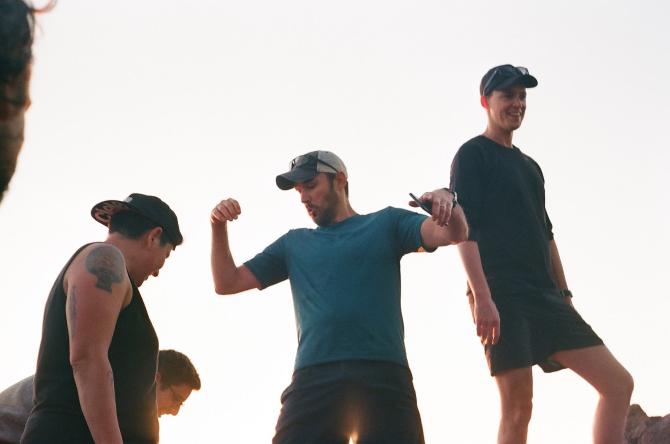
Occasionally it makes sense for a designer to travel overseas in order to help meet a deadline, onboard a new teammate, or pair with an engineer. While it’s difficult for people to leave their families, in almost every case it’s a worthwhile use of time. Sometimes all the process and remote culture in the world can’t replace good old-fashioned, face-to-face interaction.
What it takes to design remotely
Of course there are a number of other factors that contribute to a successful career as a remote designer — a comfortable space to work, UI Libraries, a considerate approach to all-company communication, and solid internet to name but a few. But the tips mentioned here are the ones that have done the most to improve our day-to-day process, and they continue to help us feel collectively inspired and creative as a distributed team.
Ultimately design is a journey — an elaborate dance of inputs and opinions, trial and error, wins and losses. When you sit among your team, a lot of this magic seamlessly weaves into natural day-to-day conversation by virtue of sharing the same physical space. But when you’re remote, it becomes the job of each individual designer to curate and deliver that journey to the team in different and unique ways. Right now, this is how we dance.


